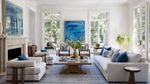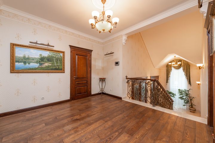
Premium Colour Selection Guide: Creating Sophisticated Interior Spaces
Colour is one of the most influential elements in interior design. It affects how a room feels, how large or small a space appears, and how different design elements interact with one another. Whether designing a home, office, hospitality venue, or luxury living environment, colour choices often play a significant role in shaping the overall atmosphere.